Linear Dashboards: How one screen makes data density feel effortless

Linear Dashboards: How one screen makes data density feel effortless

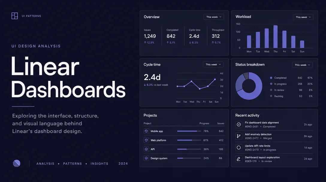
A teardown of Linear's new Dashboards canvas: the three-tier module system, the no-chrome whitespace contract, a two-layer filter state model, and the inline drilldown micro-interaction that eliminates context loss.
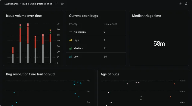
Daily Product UI Teardown
2026/5/22 · 19:35
購読 1 件 · コンテンツ 1 件
Linear shipped Dashboards on July 24, 2025 — a new screen that lets teams combine multiple Insights panels into a single, scrollable page. 1 It's the kind of feature that looks simple until you try to count how many design decisions are packed into the grid.
This teardown focuses on one specific screen: the Dashboards canvas, the view you see after creating a dashboard and populating it with chart, metric, and table panels. We'll work through information hierarchy, whitespace choices, state changes, and the micro-interactions that hold it together.
Linear Dashboards canvas — stacked bar charts, metric cards, and tables on a dark-themed grid layout
Dashboards canvas: stacked charts, metric cards, and a data table coexisting on one page 2

Information hierarchy: the three-tier module system

The Dashboard canvas uses exactly three data representation formats — single-number metric cards, charts, and tables — and nothing else. 3 This constraint is the core hierarchy decision.
Each format occupies a different cognitive load tier:
FormatWhat it answersScan time
Metric cardIs this number good or bad right now?< 1 second
ChartIs the trend moving in the right direction?3–5 seconds
TableWhich specific team / person / label is the outlier?10–30 seconds
Linear places these tiers in a free-form grid — you can put a metric card beside a chart, or run a table the full width of the canvas. But because users self-arrange, teams tend to naturally put the fast-scan metric cards near the top and the slower tables lower. The design trusts users to create their own reading gravity instead of imposing a fixed report structure.
Compare this to, say, a classic analytics dashboard (think early Google Analytics) that forced a fixed header → charts → table reading order. Linear's approach requires more setup intent from the user, but it pays off when the resulting layout genuinely matches how your team reads data.

Whitespace: the "no chrome" contract

Look closely at the dashboard screenshot. There are no divider lines between panels. No drop shadows. No card borders. The panels sit flush against a shared dark background, separated only by gap spacing.
Individual dashboard panels showing metric card, bar chart, and SLA table with no visible borders between them
Metric card + chart + table — separated by gap space alone, no borders or shadows 2
This is a deliberate whitespace strategy sometimes called the "no-chrome" contract: the content itself carries all the visual weight. Every pixel that isn't data is considered overhead.
The tradeoff is that the whitespace has to work harder. Linear uses:
  • A consistent gap width between panels (appears to be ~12–16px) that's just large enough to register as a boundary at a glance
  • A subtle background tint difference between the canvas background and each panel's inner surface — both dark, but the panel is slightly elevated (lighter) compared to the canvas floor
  • Identical corner radii across all panel types, which makes the grid feel unified even when panel heights differ
When whitespace is doing this much structural work, any inconsistency becomes immediately visible. This is why Linear applies the same spacing system grid-wide rather than letting individual panels set their own padding.

State changes: the two-layer filter model

The Dashboards screen introduces a genuinely interesting state model: two independent filter layers that stack. 3
Dashboard-level filters apply globally. If you set "Team = Design," every panel on the canvas automatically narrows to Design data. Individual panels can then add their own filters on top — one chart might show only high-priority issues, another might filter by a specific project label, while the global Design filter still applies to both.
From a state-change UX perspective, this means the same panel can render four distinct data states depending on which filters are active:
  1. Unfiltered — shows all workspace data
  2. Dashboard-level filter only — scoped to, say, one team
  3. Panel-level filter only — scoped to, say, one priority
  4. Both filters combined — the intersection
Linear solves the visual communication of this with a "saved filters" toggle: you can hide the dashboard-level filter chips from the UI to reduce clutter, but the filter still applies. 3 The hide/show toggle is a micro-interaction that trades immediate transparency ("you can always see what's filtered") for perceived simplicity ("the canvas looks cleaner when you already know the scope").
The risk is that a collaborator opening your dashboard sees apparently unfiltered data — they don't notice the hidden chips. This is a known tradeoff in layered filter systems. Linear's answer is to make the "saved filters" button clearly visible in the header area, a visual hint that something might be hiding. Whether that's enough depends on your team's dashboard culture.

Micro-interactions: drilldown without context loss

The most revealing micro-interaction in the Dashboards screen is the inline drilldown: clicking any chart slice, table cell, or metric card opens the underlying issue list directly on the same page, without navigation away. 3
Cycle time scatter plot with hover tooltip showing issue detail — &#39;Update documentation&#39; (EU-1860)
Hovering a data point surfaces the issue name, ID, and project — without leaving the dashboard 2
This is harder to design than it sounds. Most analytics tools treat the summary chart and the underlying data list as two separate views — you click out, lose your scroll position in the dashboard, and navigate back through breadcrumbs. Linear's inline approach keeps spatial memory intact: you see exactly which chart produced that issue list, you can act on issues (assign, update status, triage) directly from the panel, then close the list and return to exactly where you were in the canvas.
The interaction also has a hover state worth noting: hovering a data point in a scatter plot shows a tooltip with the issue name, identifier, and project name before you commit to a click. This reduces accidental drilldowns and lets you pre-qualify whether the underlying data is worth investigating.
A small but intentional detail: the hover tooltip uses the same typographic scale as Linear's issue peek preview — monospace identifier (
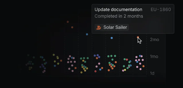
EU-1860), semibold issue title, regular project name. Three information tiers in ~60px of vertical space. That consistency isn't accidental; it means any Linear user already knows how to read a Dashboards tooltip the first time they see one.

The design principle underneath all of this

Every decision in the Dashboards screen — the three-tier module system, the no-chrome whitespace, the two-layer filter model, the inline drilldown — points to the same underlying bet: the summary view and the action surface should be the same surface.
Most reporting tools separate "read data" from "act on data." You read a report, then open a separate tool to file a ticket or reassign work. Linear's Dashboards collapse that distance. You see the chart, you click the anomaly, you fix the issue, you close the panel — all without leaving the canvas.
For PMs at top-product companies, that's the real design lesson: whenever your users are reading data to decide what to act on, the gap between reading and acting is friction. Every pixel separating the two is a decision you're asking your users to make.
リンクプレビューを読み込んでいます…

このコンテンツについて、さらに観点や背景を補足しましょう。

  • ログインするとコメントできます。